Samsung began to make drastic changes on his own TouchWiz from s6, even with his own app as much as possible to allow users to select and install in the Samsung App Store, operation logic is unified, operation steps are reduced, etc. for Samsung 15 years and 16 years won many applause. But perhaps Samsung thinks this is not enough. In the face of domestic custom hero system customization, TouchWiz appears to be tender, so Samsung introduced TouchWiz iteration: New Note UX . Samsung also provided a closed beta on June 8th, but it is only limited to Note5 . Compared to TouchWiz and domestic custom systems, can the new New Note UX get rid of the past image of Saga?
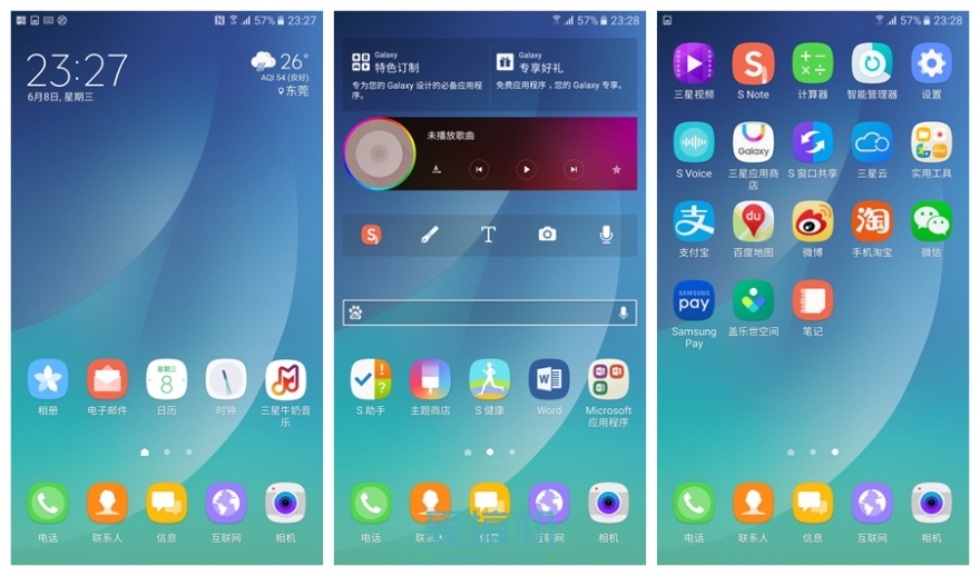
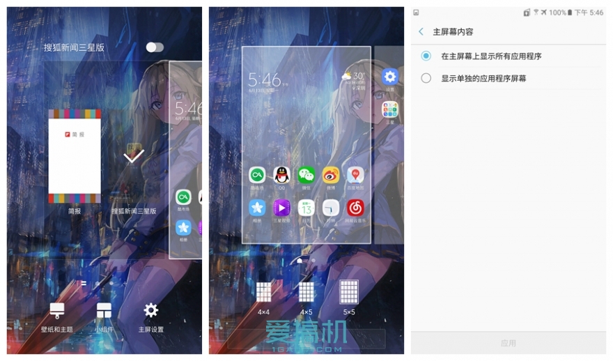
New Note UX compared to TouchWiz, the change can be described as earth-shaking, icon UI is almost completely redesigned, more flat, and more to cater to the user's attention, the main interface setting operation retains the past routines, can be used within the two-finger plan Or long press the main interface to bring up the settings menu, New Note UX still retains the newsletter, the user can also take full advantage of this 5.7-inch 2k screen by setting the screen grid. New Note UX can choose the traditional mode of Android: the main interface plus the application page or a single main interface display, you can see that New Note UX put the interface display mode to the user, allowing users to set their own main interface.
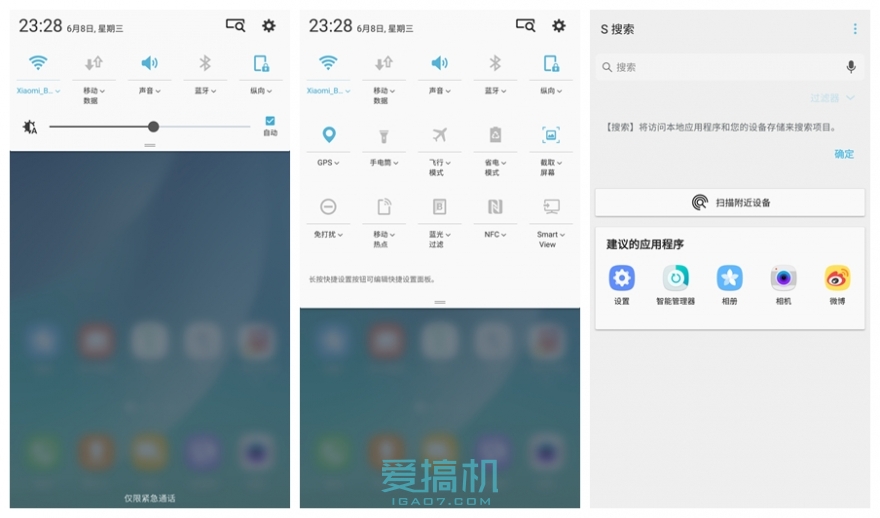
To say where the New Note UX changes can be seen at a glance, the drop-down bar is none other than that. The overall color of the drop-down bar is changed to white, and the 2-step design is used. The s search is integrated into the drop-down bar and above, and the drop-down bar is sought to be as concise as possible.
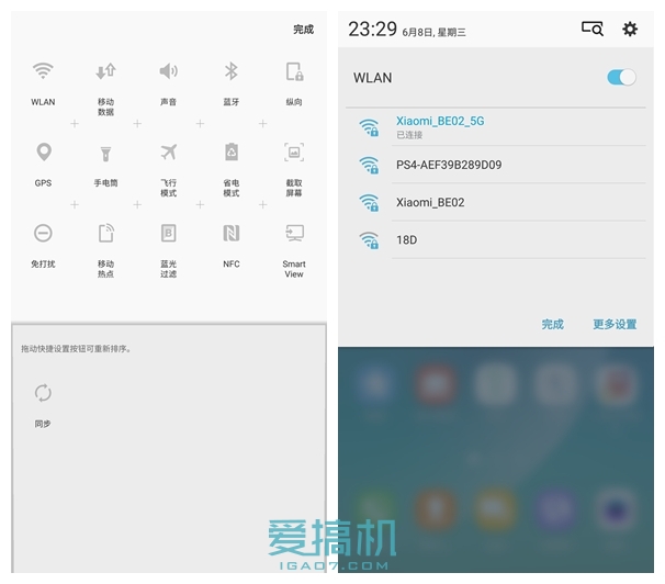
Long press pull bar can customize the arrangement of shortcut buttons, and the detailed list is integrated below the shortcut button. The user can directly perform related simple operations in the drop-down bar without having to enter different levels to set function items.
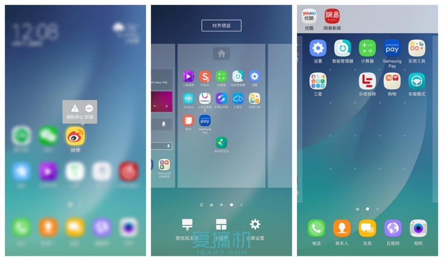
In the main interface, you can uninstall the app by pressing and holding down the app icon or slide it down. You can also add a one-click alignment icon to quickly arrange the icons. The Virgo should smile and dizzy in the toilet. On the whole, it can only be said that although these functions are a little late, they still come.
The folder has also been changed, without the constraints of the border plus the background of the frosted glass is visually very good, in addition the user can also quickly identify the classified folder by changing the folder background, more efficient than looking at the text.
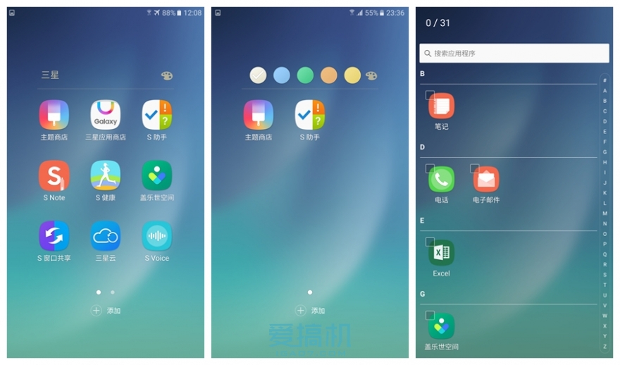
The system's built-in app has a high degree of unity in the logic of operation and color matching, so that new users can quickly become familiar with New Note UX, rather than familiarizing each app one by one as the old one. Because it is a closed beta, temporary theme stores do not support the use of the user can only replace the wallpaper only.
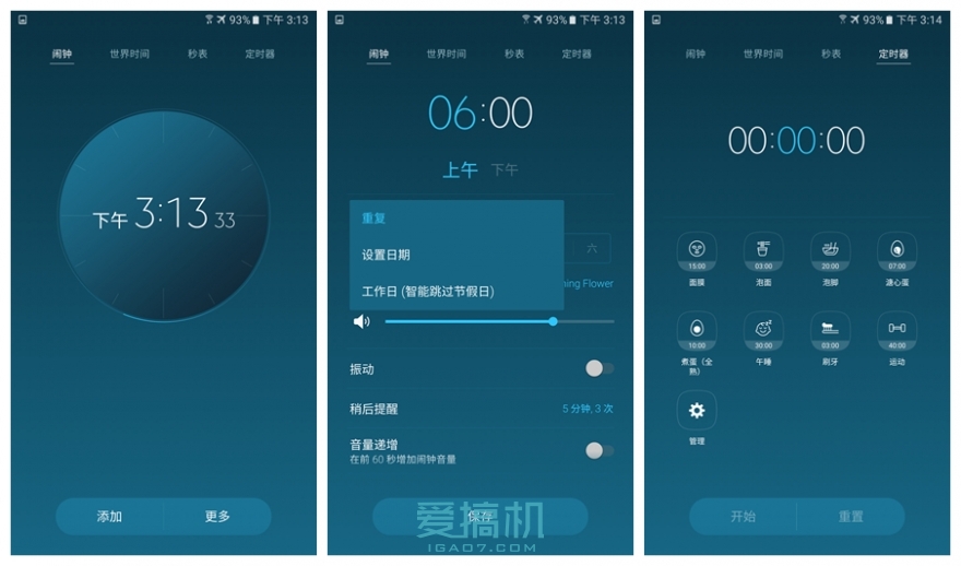
New Note UX integrates many local functions according to the habits of Chinese people. For example, the alarm clock integrates smart skipping holidays, and the timer sets frequently used timing options. It can be seen that Samsung's dedication to the localization of grounding gas, of course, there are many functions However, due to coincide with TouchWiz Xiaobian not listed one by one.
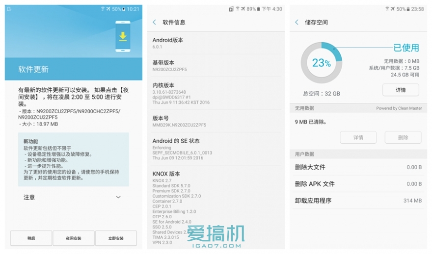
In terms of system, we have updated the latest version. New Note UX and TouchWiz are based on Android 6.0.1. After the factory settings are restored, the available space of the system is about 24.5 GB. It is still fairly well controlled.

New Note UX made a new design for the setup menu. The function classification was clearer and the interface was concise. The TouchWiz "Quick Setup" bar was removed. If you said that the previous Android setup menu made you helpless, then you really should try. Try New Note UX.
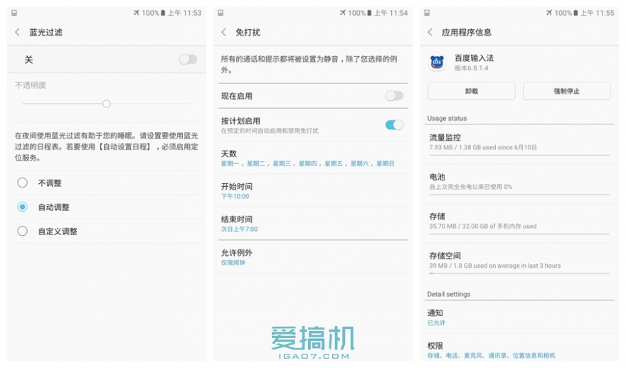
New Note UX has joined the currently acclaimed luminous mode "blue light filter", the overall experience is similar to iOS, you can set automatic adjustment, the system will automatically adjust according to the sunrise and sunset of the day, in addition the user information in the program information can be very intuitive to see It is still very useful to use the various occupancy conditions in the system to help users find rogue apps.
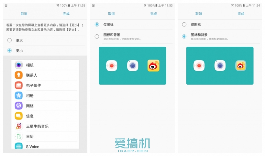
New Note UX provides 2nd-level dpi for user selection, users can adjust according to watching habits, and New Note UX also optimizes the icon of third-party app, users can choose to display original icons or processed icons.
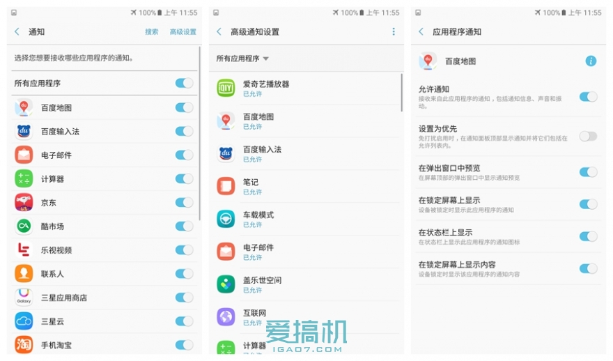
Finally, New Note UX gives the user a lot of control over the application notification. The user can set the importance of the application according to the application, and avoid the phenomenon that the notification bar is pushed by the spam, and the priority is added. The availability of noise free mode is greatly improved and worthy of praise
The days of using New Note UX are summarized in one sentence as familiar strangers. In the operation experience, the shadow of TouchWiz can be clearly felt, but the unification of the interface's further flattening, streamlining, and operation logic makes people feel brighter. Localized in-depth optimization also makes the overall experience more grounded and most important. The point is that New Note UX, which doesn't seem to change much, has made great efforts on operating costs. Many of the user's operations can be done on one interface. The user saves time without knowing it, and these inconsequential changes, once you get used to it, may not go back.
Of course, because it is a closed beta, Xiaobian can obviously feel the dropped frames when using Note5 to experience New Note UX, and it also died 1 or 2 times, but after all, it is a closed beta, and it can no longer require too much stability. Xiao Bian is also very much looking forward to the official version coming in September. At that time, we will bring you more detailed system evaluation.